Disclaimer: The following blog entry is a guest post from a paying user of NordPass, as our company uses another product. It is an exercise meant to educate viewers in how to locate perceived design and feature weaknesses in the NordPass desktop application and then how to possibly improve them, all of which are personal opinions. Also, the work only shows suggested updates to the current interface, not a new interface created from sctratch. The name of the product and the icons used in the design, including logos or avatars of actual companies, are the properties of those individual companies. This is an educational presentation only and is not connected to NordPass or any of the companies shown in the interface mockups.
Thinking About How to Improve NordPass
NordPass produced a solid desktop application that I use each day. But, like all applications, it’s imperfect. Some aspects of it are frustrating enough that I contacted the company to provide a feature request. A NordPass representative responded that my suggestion was not a feature their team had in mind at the time. So I thought I’d write a blog post to address it, though my desired version of their software will likely never come to fruition.
First, I reviewed the current interface to select what I considered its strengths and weaknesses. Next, I considered design and functionality improvements. After that, I attempted an interface revision to present how I would update the current one to make it more user-friendly.
Current NordPass Interface
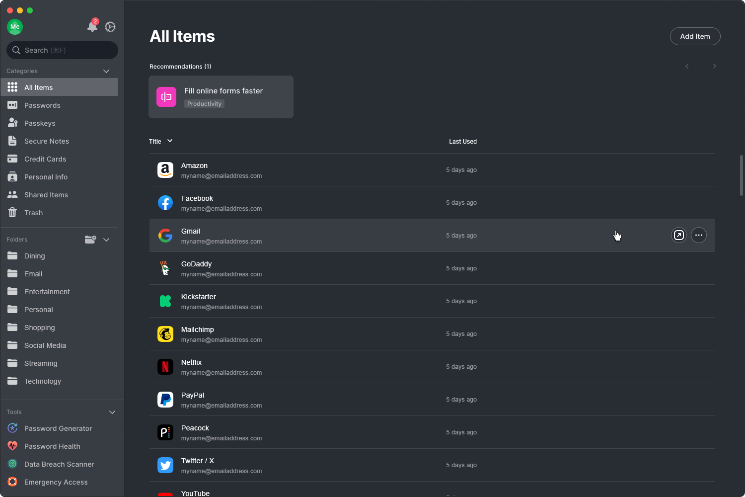
This is a screenshot of the actual, current interface which I have modified with mock details such as folders and login entries.
Current NordPass Interface with Notes
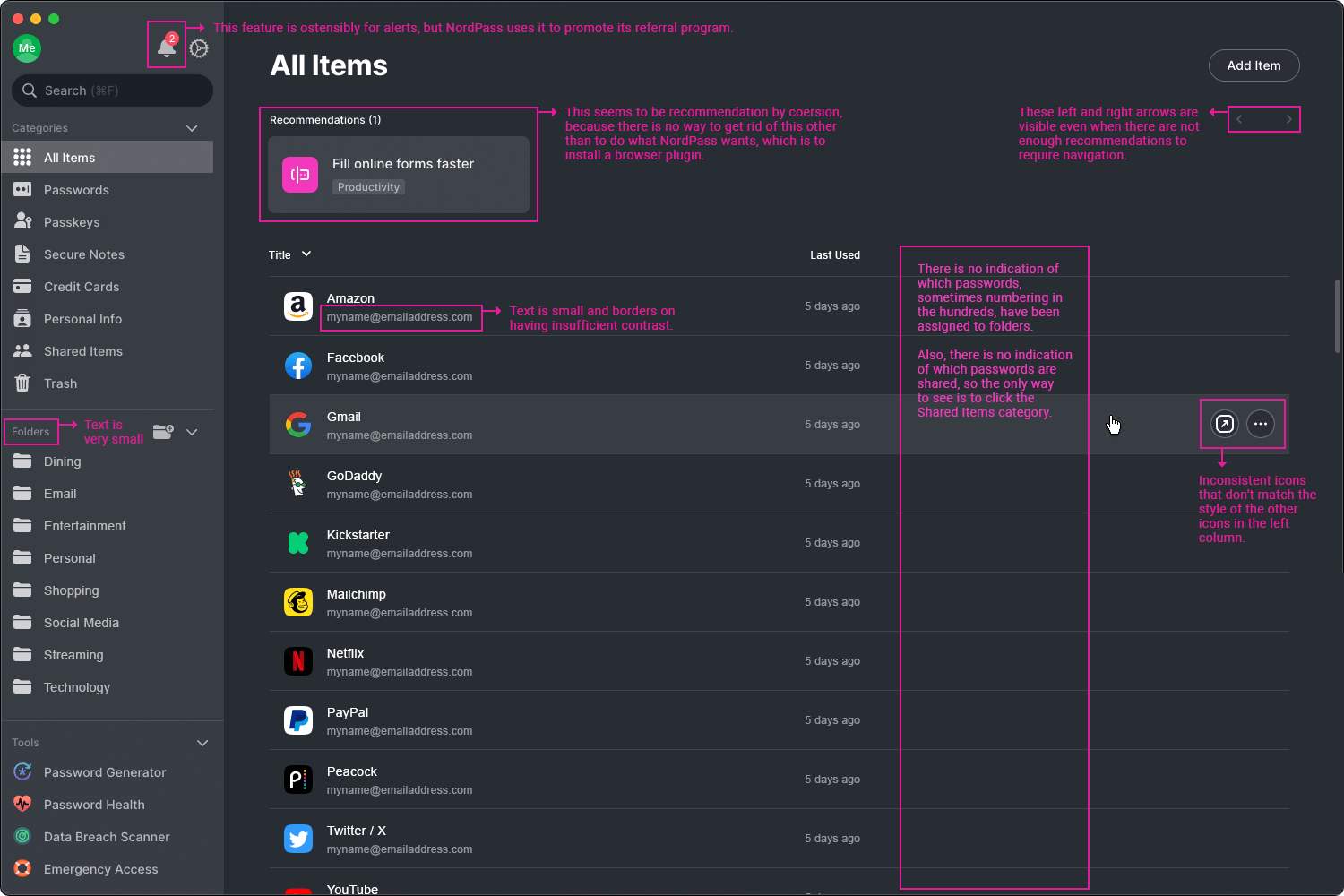
This is the same screenshot as above, but I have added notes into the graphic, which I will discuss below.
Current NordPass Interface Weaknesses
Lack of Folder Indicators: On the All Items screen there is a large amount of space for indicating passwords that I assigned to folders via an additional column. That was the request that I sent to their team, but their response indicated it wasn’t important to them. Why is it important to me? Here’s why:
- When I moved to NordPass from another service, I imported over 300 passwords.
- Then I set up folders and began password assignment. However, I didn’t do them in order, nor did I finish them on the same day.
- When I worked on them the next day, I realized I had no idea which passwords I already assigned to folders and which existed only in a category like Passwords (left column).
- My solution? I spent unnecessary time going back through each password to see which ones I assigned to folders and then rename each of those by adding prefix text such as “Email – ” or “Social Media – ” so that I’d know I had worked on it. That way I could locate ones that I still needed to add to folders.
- What’s the solution? Add a single column on the main screen which shows folder designations.
Suggestion: Create a column for folder designations and consider changing it to tags.
Weak Sharing Indicators: Like the lack of folder indicators, there’s no easy way to tell if a password is shared or not. I pay for the family plan so that we can share passwords with each other. If I’m in the main interface, how can I tell which passwords are shared by easily scrolling? NordPass adds a tiny, gray icon with two heads beside the name of the password. It’s so small and insignificant that it may as well not exist at all. Suggestion: Create a column for shared entries.
Small Text: I’m not twenty years old, and I have the poor vision to prove it. That means I have sub-optimal sight which makes reading some NordPass text more difficult. Not only is the text small little in places, but it borders on too little contrast. Suggestion: Make the smallest text slightly larger and ensure a minimum amount of contrast.
Misuse of Alerts: In the top left area of the interface sits a bell icon, which is ostensibly presented there for alerts. However, in addition to alerts, NordPass uses that area for marketing promotions. The marketing items are so persistent that I no longer click on the bell icon. Suggestion: Separate Alerts and Notifications under two icons.
Recommendation = Coercion: Below the text All Items is an area used for Recommendations. However, one of them titled “Fill online forms faster” doesn’t have a method for deleting it. In a practical sense, that makes it a requirement of sorts or at least coercive. If I don’t install the browser plugin—which I refuse to do—NordPass forces me to live with the so-called recommendation panel in perpetuity. It’s frustrating that I can’t get rid of it. Suggestion: Add a close/delete button to all recommendations.
Unnecessary Recommendation Arrows: The left and right arrows located on the right side of the screen exist even when there are not enough recommendations to make them useful. So they sit there on the screen and do nothing. Suggestion: Remove left andright arrows if they aren’t functional.
Inconsistent Icons: This one is minor. The left column icons, which are generally consistent, don’t match the icons in the right area. Suggestion: Perhaps update to slightly more consistent images.
Revised NordPass Interface
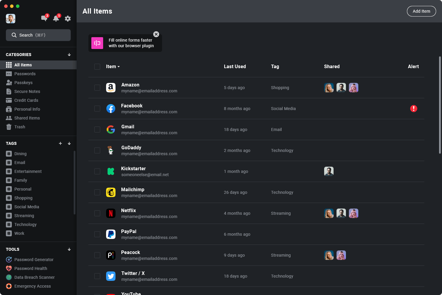
This is a mockup I created to show how to possibly improve the NordPass desktop application interface.
Revised NordPass Interface with Notes
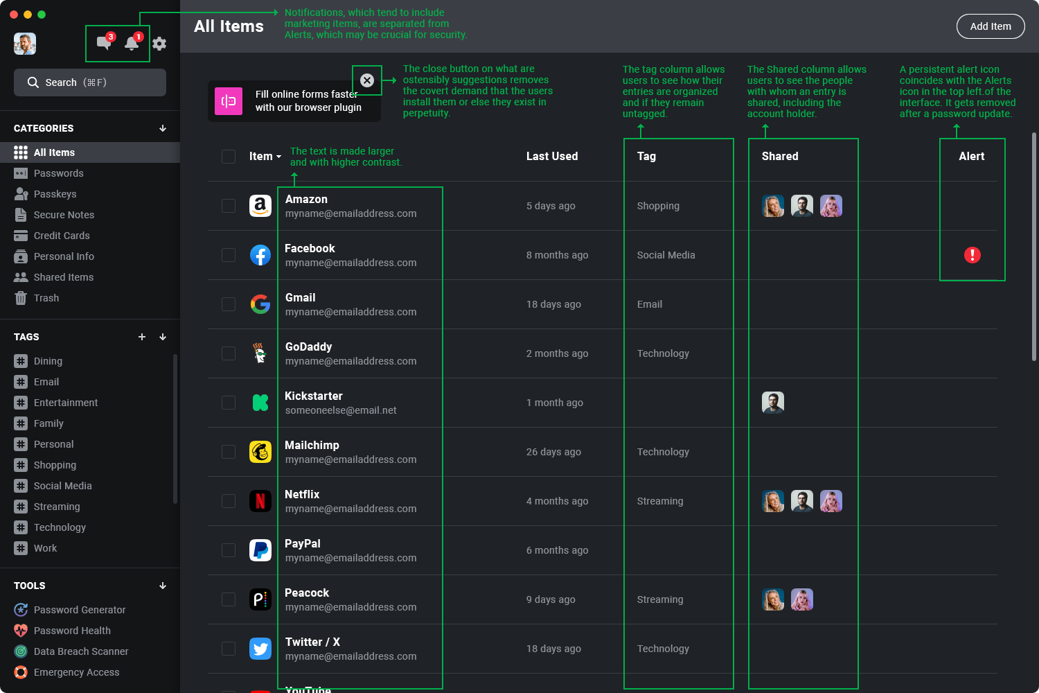
This is the same mockup interface revision above, but with notes added.
Revised NordPass Interface with Notifications
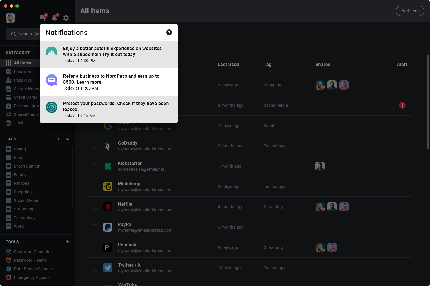
This is the same mockup interface, but this time with a Notifications modal.
Revised NordPass Interface with Alerts
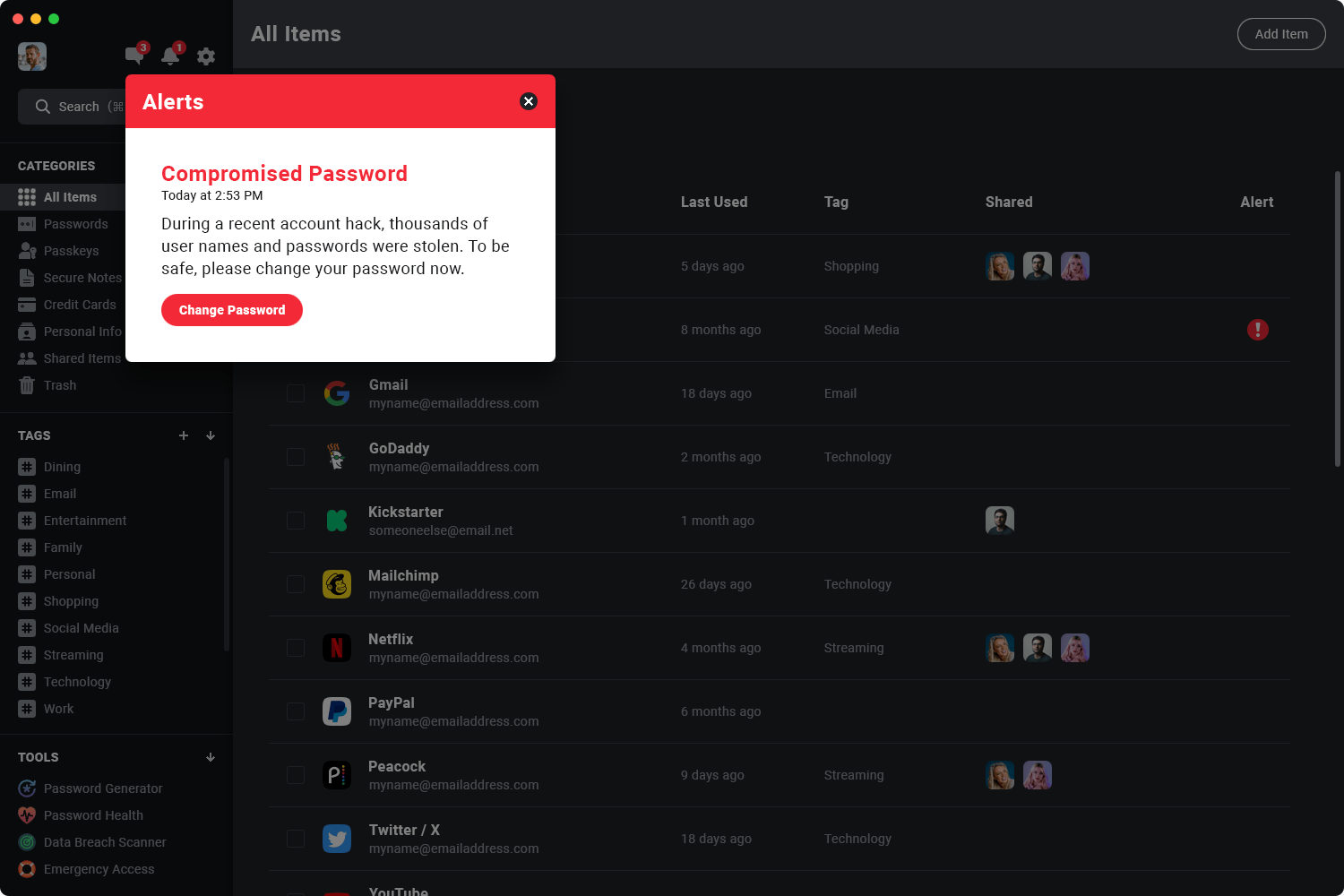
This is the same mockup interface, but this time with an Alerts modal.
How to Improve NordPass Desktop Application Interface
I will reiterate the suggestions in one place.
- Separate actual alerts from informative notifications.
- Enlarge the size of smaller text found in the current interface.
- Create higher contrast across the screen by darkening the background colors.
- Add a close (X) button to all recommendations.
- Add a column for tags (formerly folders) to show which ones have been properly categorized.
- Add a column for shared entries with headshots of the share recipients.
- Add a column for alerts for those items that have significant security risks.
Not Shown: Mouseover on individual entry line to show functionality for launching a website, showing options, etc.
Conclusion
I’ll mention again that I’m a paying customer. I use NordPass each day and like it a lot. But it has some weaknesses, in my opinion, that the company should improve. My suggestions are just that—suggestions. So, in the unlikely event that a NordPass team member reviews this, they can take the ideas or leave them.
Since I am a current customer, would I choose it again over other options? Yes, in my opinion, NordPass is a very good password protector, especially for the money. I’m glad to have desktop software and not just browser-based solutions.
Contact Information
This is a guest post, but you may still feel free to contact me at the email address below. I will never post your name or email address.
Bill Adams
[email protected]
If you would like to speak to someone at Streamline about a project, please contact us any time.